
Zenibyte Creative
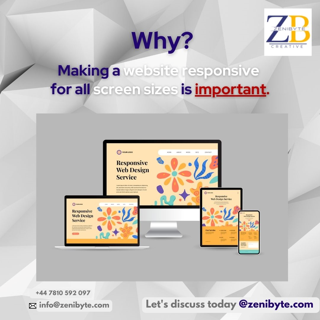
Why making a website responsive for all screen sizes is important?
Every business or organisation needs a website to stay competitive. And the increasing use of smartphones and tablets means that optimising your website for all screen sizes is vital. That's why responsive web design is so important.
With responsive web design, websites are created with screen sizes that automatically adapt to the devices being used to view them. In other words, your website will look and function properly no matter whether it is viewed on a desktop computer, laptop, tablet, or smartphone.
Responsive web designs offer a number of benefits, including:
1. Better User Experience
All screen sizes should be supported by a website to improve user experience. No matter what device a visitor is using, they will be able to easily navigate through the site. As a result, engagement and conversions can increase.
2. Increase in Mobile Traffic
Mobile Internet usage is increasing as more and more users access websites from their mobile devices. Increasing your mobile traffic is much more likely with a responsive website if it can be accessed and viewed more easily on smartphones and tablets.
3. Better Search Engine Rankings
Search engine rankings can also be improved with responsive web design. Because Google now rewards mobile-friendliness with higher rankings. You may suffer penalties in search engine rankings if your website isn't mobile-friendly.
4. Reduced Bounce Rates
Mobile-unfriendly websites can have high bounce rates. Visitors who abandon your website after viewing only one page are referred to as bounces. You have a better chance of keeping visitors on your site and letting them explore further when you have a responsive website.
5. Cost Effective
The responsive website design eliminates the need to create separate websites for different devices by creating one website that can be viewed on any device, regardless of size. In the long run, this can save you money and time in terms of developing and maintaining your website.
Making your website responsive is easy if you follow these tips:
1. Bootstrap or Foundation are good responsive design frameworks.
2. Increase loading speed by optimising images and videos.
3. Flexible grids can be adjusted to fit a variety of screen sizes.
4. Use easy-to-read typography.
5. Keep mobile ads and pop-ups to a minimum.
Conclusion
To optimise a website for all screen sizes, you must use responsive web design. You can increase your business or organisation's success in the digital world with responsive design because it offers, not only better user experiences, but improves mobile traffic, lowers bounce rates, raises your search engine ranking and is cost-effective.
Take control of your website. Here, at Zenibyte, we offer our skills and reliable, professional advice for website design and development, WordPress solutions, eCommerce, experienced Mobile app design / development, solid Software Solutions, Digital Marketing, SEO Optimisation and much, much more.
See how we can build an amazing website for your business. Book a call today.

Zenibyte Creative
Zenibyte is a leading web and mobile app development company in the UK.